The internet cut last night at around 12-ish. Whereas I thought this was initially due to an outage or a crappy node from my provider (happens) it turns out it was due to an outstanding bill. Now, this is a kick in the butt because the company I hire my internet from have no customer support running on weekends. Don’t ask, I have no idea why this strategical business decision was made. This all meaning; “no internet for you”.
Usually when something like this happens I turn to my trusty hotspot feature and my poor phone gets used like a whore by every device in my room. I was using my data sparingly, but it’s Sunday, I want to do something before being dragged back into another week’s worth of work. I decided to work on the only project I have going that will allow me to bang out a few lines of code and still have something to show for it the same day: this site.
I like the current setup I have for this site, it’s quick and easy for me to mod. Vue is more my thing, I’m no Ruby dev, but I understand Jekyll quite well so I can dive in deep whenever I want (not that there’s anywhere too deep to dive with Jekyll). The basis for this Jekyll theme wasn’t my own creation, however I’ve added and changed so much about it that I’m just going to create my own based on what I’ve modified here.
Anyways, my point was that I spent a little time creating the theme you see before you. I call it Ternative, and I was able to make light and dark variants. I used my data to commit these updates and spent a little time on Mastodon checking up on things. After some time, I booted into what I call my “bitch” machine; my Windows machine. I only use this thing for government portals and social security websites, as for me to use a digital certificate that my gov provides I need to be on Windows. It’s used for other stuff too, but this is the main reason I haven’t formatted the drive and slapped Linux on there.
I went to check for updates, as any decent human should always do, and to my surprise the hop from Windows 10 to 11 was finally an option for my machine. It had been the case that I was waiting around for a while now for my manufacturer to get the green light, and here we are.

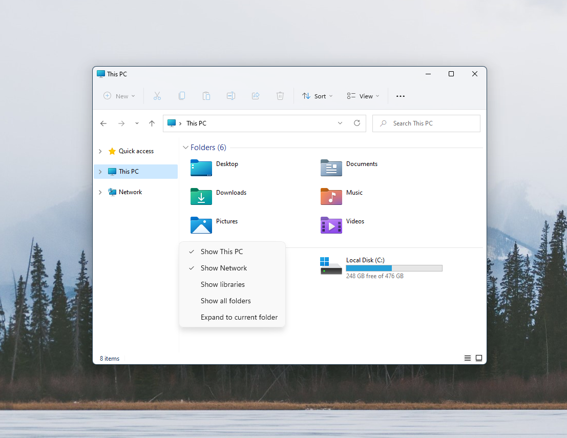
I was pretty excited for Windows 11. It looked like Microsoft was finally recognizing that they needed to step up their game as people everywhere seem to be swooning over Apple products lately. The promotional material and screenshots looked cool, and whereas I can see firsthand that some long awaited stylistic changes have finally been addressed, that’s where things end for this update. It’s just a new skin slapped on the famously sporadic Windows 10, with its ancient Event viewer, two versions of Snipping tools and Control Panel as well as a Settings app.
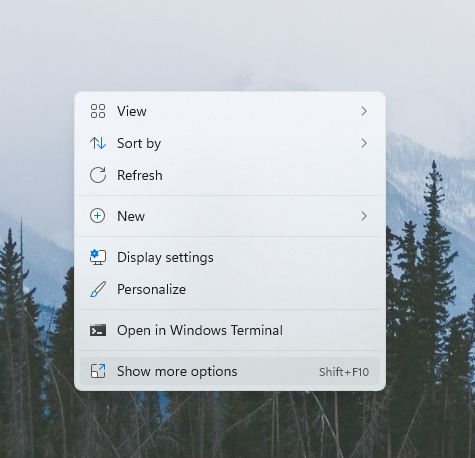
The most annoying thing however, is the fact that they have sacrificed functionality over style in some cases. The best/worst example of this that I can see is the context menu. I’ve built apps in the past that are only intended to be visible and accessible via the context menu. I know of other apps that do this as well, MP3tag being a great example. It’s an app that is intended to be quickly launched with a simple right-click. Gone now. Now you need to right-click, go to the section marked “More options” which will expand an original version of the context menu and then you can select the option you meant to in the first place. It’s so easy to see that they made this decision for aesthetic reasons.
At the time of writing this I have spent about 15 minutes at most digging through the changes before deciding to stop so that I wouldn’t be too disappointed by what I might find. It’s Sunday night and I’m just not in the mood for more of this. It’s not all doom and gloom, there are some things that look and feel great. The new sound palette, updated connections menu and transitions look much better. The icons look like garbage, but that’s a personal point of view.
I’m heading back to my Xubuntu partition now. Right now.
